Gut renovations -- aptly named to describe the stripping down of a space to its bare bones and starting fresh, the visceral fortitude forged with each decision leading up to the finish line -- are exhausting. But the payoff is the drama of the before and after. Particularly when the "before" describes a dilapidated warren of rooms that are nearly impossible to recognize as a home, the "after" feels like a hard-won victory.
Read MoreLABOR OF LOVE - UPPER EAST SIDE CARRIAGE HOUSE
Last February I was contacted by a friend of a friend of a friend to help make an NYC carriage house, with gorgeous bones but a sad face, a livable home for her family. The intention was to essentially stage a quick makeover to tide them over until a much more comprehensive renovation in the future.
To that end, my client re-used most of her existing furniture, and my task was to assist with the big picture and fill in where necessary: architectural elements, easy makeovers for some existing pieces, and some new things for each space. Not unlike most projects, it only grew as time went on. Many were involved. It took on a life of its own. And my fearless client took on huge chunks of the project herself -- an unenviable choice. The family is all moved into the house now. A labor of love, the project will never be completely over. For now, I am very happy to share some snaps!
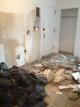
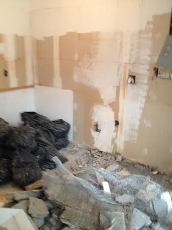
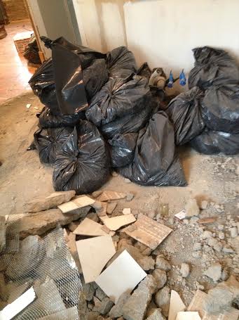
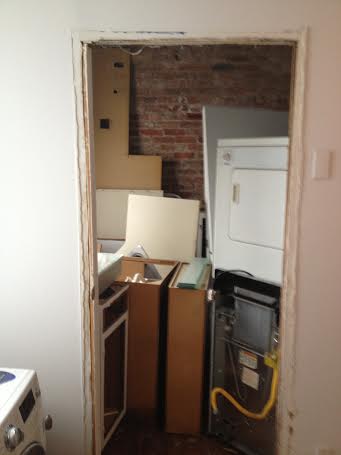
ALL I WANTED WAS TO BREAK YOUR WALLS
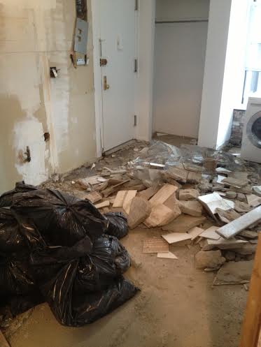
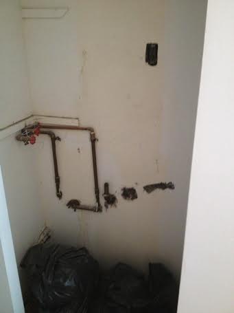
Since the moment I set foot in my client's then-potential new space, I could not *wait* for demolition to begin.
Well, it has. And the wreckage is as cathartic as ever, which means her remodel is that much closer!!!
ABOUT FACE ::: TECTONIC SHIFTS
Just as babies become the toddlers who grow up to be wallflowers or leaders or parents then grandparents, changing a litle bit every day -- so too does our world change bit by bit. But every now and again, something huge happens. Like when tectonic plates inching along crash at last, completely changing the landscape forever.

Side note: Check out this sweet video that captures the aging of a young girl over a hypothetical span of 70 years.
Like the way cubism, and the representation of multiple planes simultaneously in a single picture, forced so powerful a shift in artistic perspective that its influence extended beyond two-dimensional art into sculpture, architecture, and also the non-visual arts-- literature, philosophy, music.


Visiting Adolf Loos' Villa Muller in Prague was that for me - a pivot point.
Authors like Beatriz Colomina (among many others) more eloquently describe the intensity with which Loos wields architecture - and the juxtaposition of rich and complex interior compositions against a stark facade - as a tool to comment on the human condition and the split between our private and public lives....
Anyway, I remember taking in the sumptuous materials, the spatial genius, the surprisingly vivid colors; and I was stumped by the presence of this table lamp that seemed so out of place.

But I've come around since then, and perhaps Loos foreshadowed the work of Thaddeus Wolfe, whose glass Assemblage pieces illustrate the impact of cubism in three-dimensional art forms. Loos' table lamp, with its geometric forms, symbolizes "a profound reorientation towards a changed world."
With every movement come faddish elements as well, and geometric forms are trending pretty hard right now, and the fullness of time will reveal each piece's lasting power. With everything frozen with this winter storm, a little time capsule of related eye candy we can come back to later seemed appropriate:


EVERYMAN'S NYC APARTMENT RENOVATION
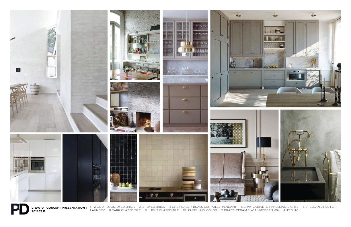
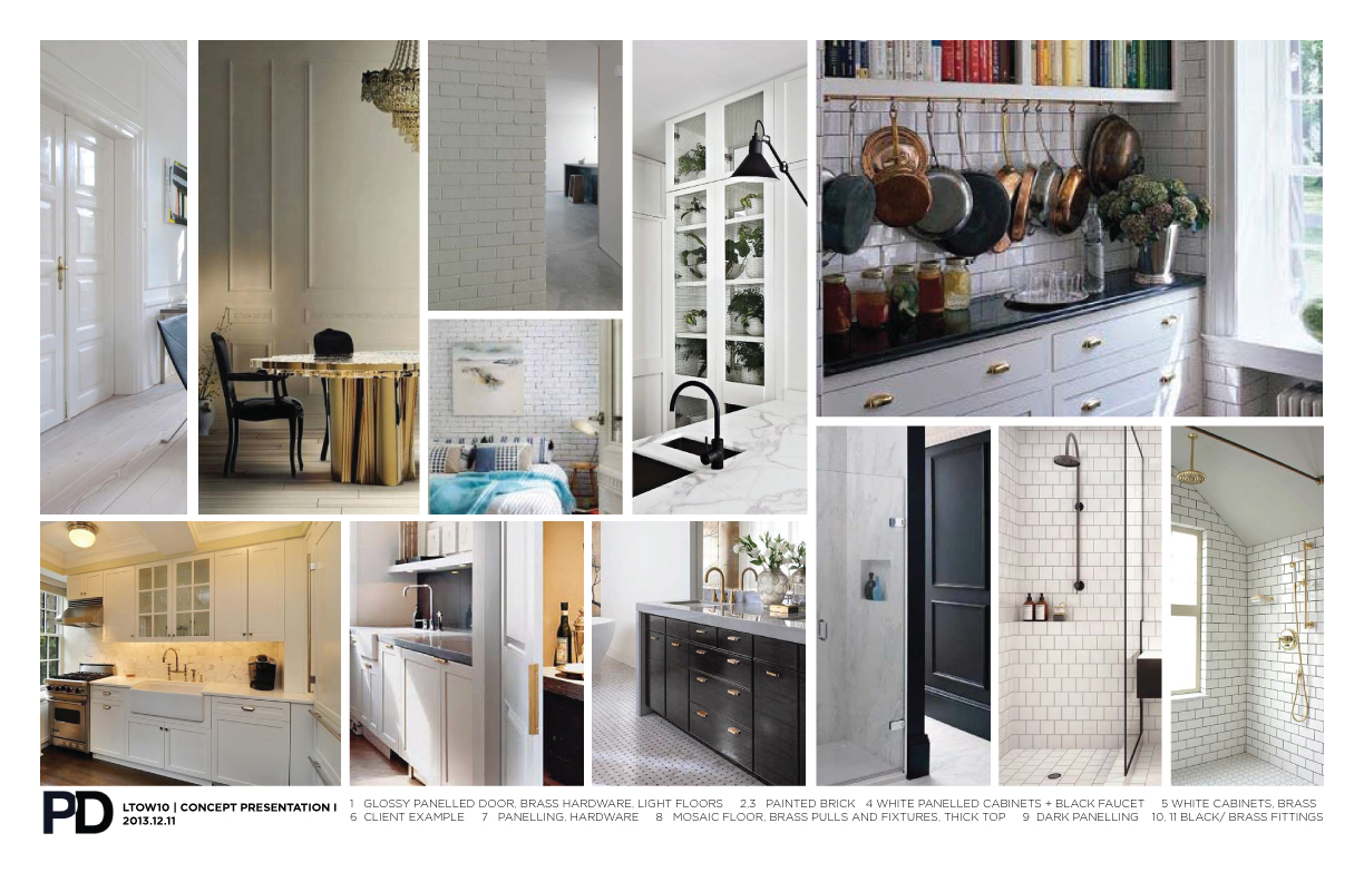
Interior design doesn't save lives - but if, by giving a client surroundings that are comfortable and encourage a happier, more successful life, then I believe it serves some sort of civic duty. It's an intimate process getting to know how clients live, what their pet peeves are, their comfort levels with high vs. low maintenance materials, the colors that turn them off, whether they cook often or rarely, do they hate brass - key details in narrowing down the infinite number of options out there.
*Related: I've created a handy bundle of links you can access here with information about doing renovations in NYC. *
When honing in on design decisions, since it's often just as useful to know what a client does NOT want, at the beginning of a project, I'll usually present a couple of options for the layout and materials as a starting point to gauge the direction in which to steer the project.
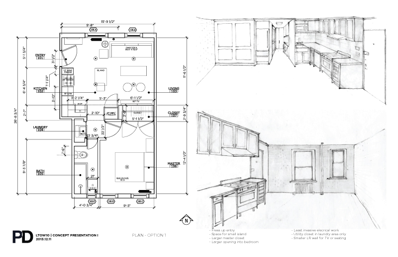
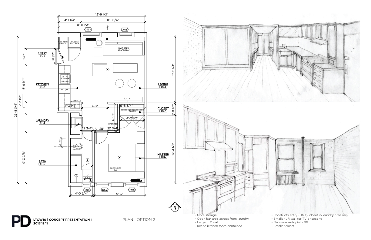
I'm currently working for a lovely client, a young woman with a big personality in a small frame, to renovate her one bedroom apartment in a classic West Village walk-up in NYC. Her project comes with all the challenges you'd expect: it's just under 400 s.f. and needs to house all the programmatic requirements of a high-end apartment:
- The kitchen needs updating: a full-size fridge/freezer, we'll add a dishwasher and disposal, a new range and fan, new sink and faucet, and a wine fridge if there's room.
- It has a washer/dryer, which is a luxury for sure, but takes up valuable space.
- We're taking out a wall.
- New floors, new cabinets, new tile. New ceilings, new walls, mouldings.
- The bathroom is tiny - let's make it feel less tiny.
- It's a co-op building.
- There's no elevator, and it's on the fourth floor, so demo and construction will be a bit of a bear.
So there's plenty for me to sink my teeth into.
I presented three plan options last week, and there are pros and cons in each, spatially; I await professional estimates of the cost implications as well. Since it's not her home, the insight I would normally get from the client directly can only go so far. I saw the space again after presenting the options below, and I am working a revision I think negotiates some of the different advantages best.
My goal is always to make choices that are timeless - and still tailored to specific preferences. I am always conscious of budgets - which can be fluid if a client has a deep enough emotional connection and the means to make an exception. In trying to develop a design that is generic enough to appeal to the widest audience, the risk is that the wow factor desired by having me involved at all would be diluted.
Meanwhile, I welcome comments. Stay tuned.

GET YOUR VITAMIN D : CLERESTORY WINDOWS
The days have been getting shorter for some time now, and having Thanksgiving under our belts reinforces the fact that we are into winter, the season of vitamin D deficiency.
I was passing through Grand Central last week, on a gray and misty morning, and the sun was coming through the clerestory windows in the main concourse with all the drama of the old John Collier photograph that is iconic for the space.

Even on a gray day, what little light there was made hard angle to the space below. It was a welcome reminder of how natural light - i.e. from the sun - can be a powerful architectural element when strategically employed.
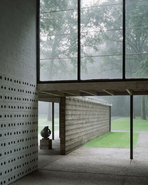
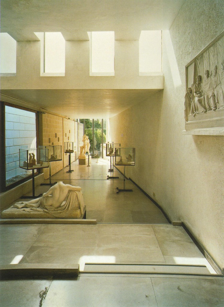
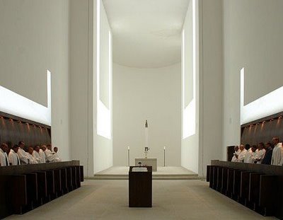
Having a whole room bathed in light is sumptuous, for sure. Often times, however, bringing the light into a space requires some architectural gymnastics. And sometimes, you just want a room to feel more closed for privacy. Sometimes we seek sanctuary from the visual clutter outside; but we don't want to feel imprisoned. In those cases, clerestory windows are the answer to our sun-seeking prayers.
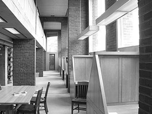
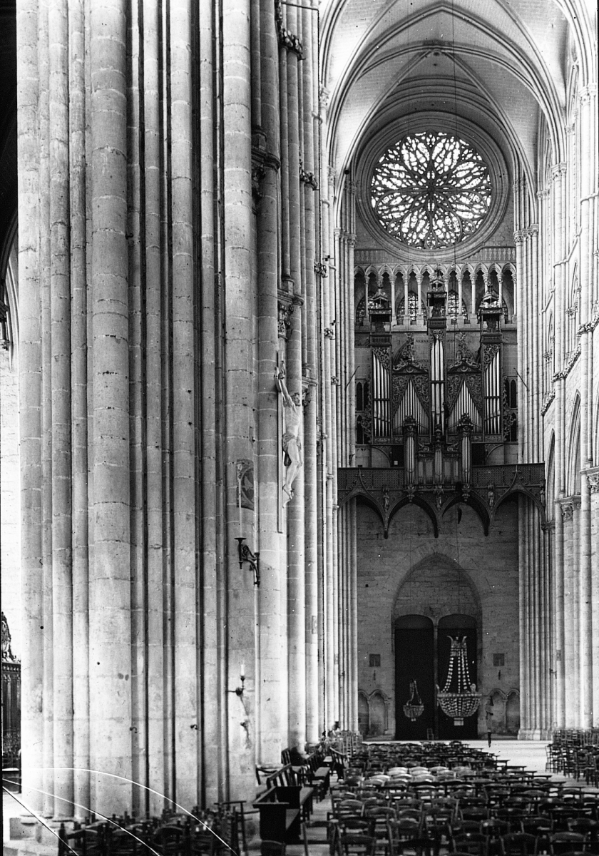
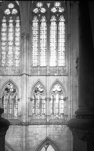
Clerestory windows refer to any windows above eye level, and would historically refer to the upper levels of Romanesque or Gothic cathedrals which were often pierced with fenestration to bring light down to the people. One of the most dramatic examples of Gothic architecture, the Cathedral of St. Catherine at Amiens (right), has clerestory windows that are nearly a third of the interior height!
In modern architecture, the clerestory is more often horizontal. Having window up high means you gain wall below -- in residential design, those walls are then freed up for art, kitchen cabinets, built-in bookshelves, a cozy bedroom. In public buildings, you can maximize the use of the internal volume while still bringing in natural light.
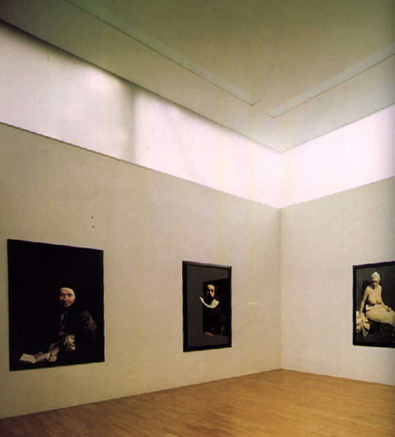
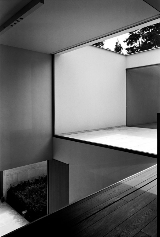
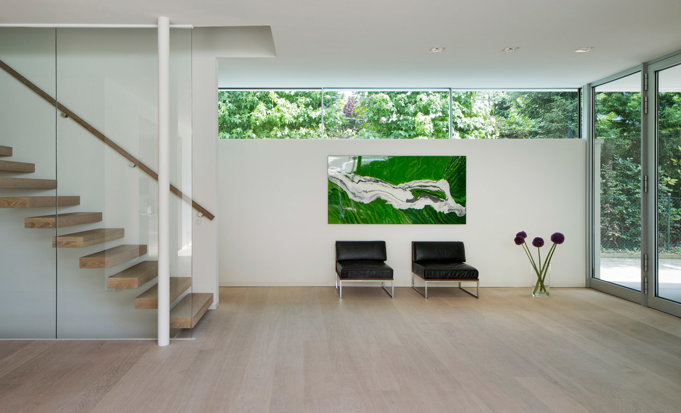
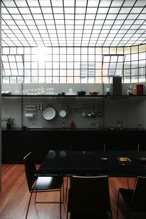

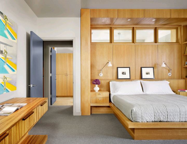
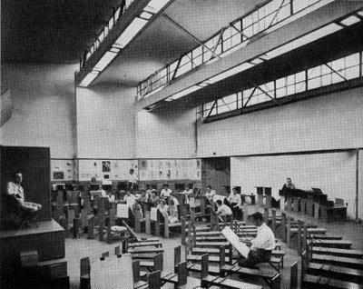
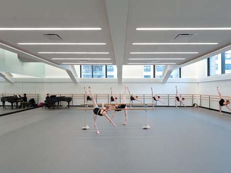
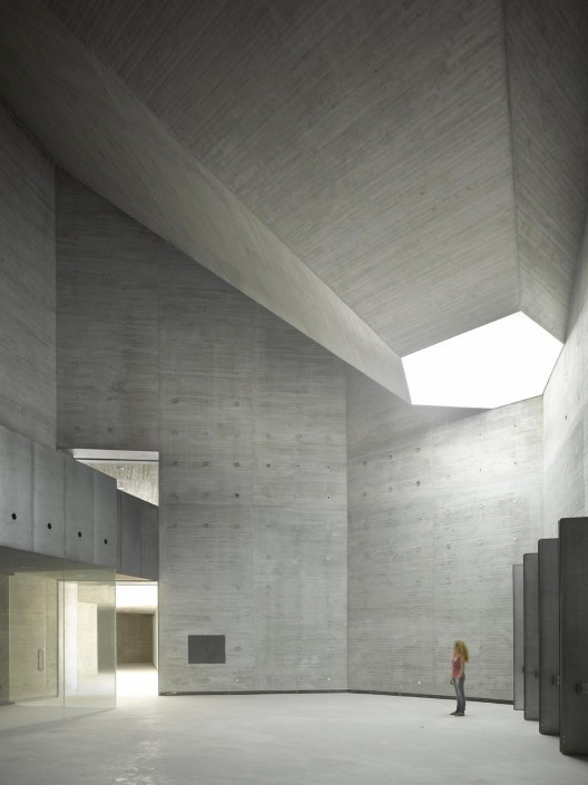
The iterations of a clerestory window are infinite, and can adapt to a multitude of architectural languages. In all versions, the void - the absence of wall - becomes something with unexpected presence and natural grace. So many beautiful examples to admire and emulate.
In designing the Canova plaster cast museum, Carlo Scarpa said, "I wanted to cut up the blue of the sky." Until the sunshine stays longer again, I say bring those heavens in.